Graphic Quick Tip: Gradient Mapping
There’s a lot that goes into making a great graphic design. I’ve edited many images over the years and wanted to share some advice. I drafted a whole article on the basics of graphic design, but there’s way too much to cover. Plus, people with actual degrees in that have plenty to say on the subject already. Instead, I decided to just focus on some specific techniques I’ve grown fond of. Today I want to talk about gradient mapping.
Gradient mapping converts an image into black and white, then converts those values into whatever colors you’d like. Here’s a picture of me, Flaminia, from an old photoshoot to illustrate the power of gradient maps:
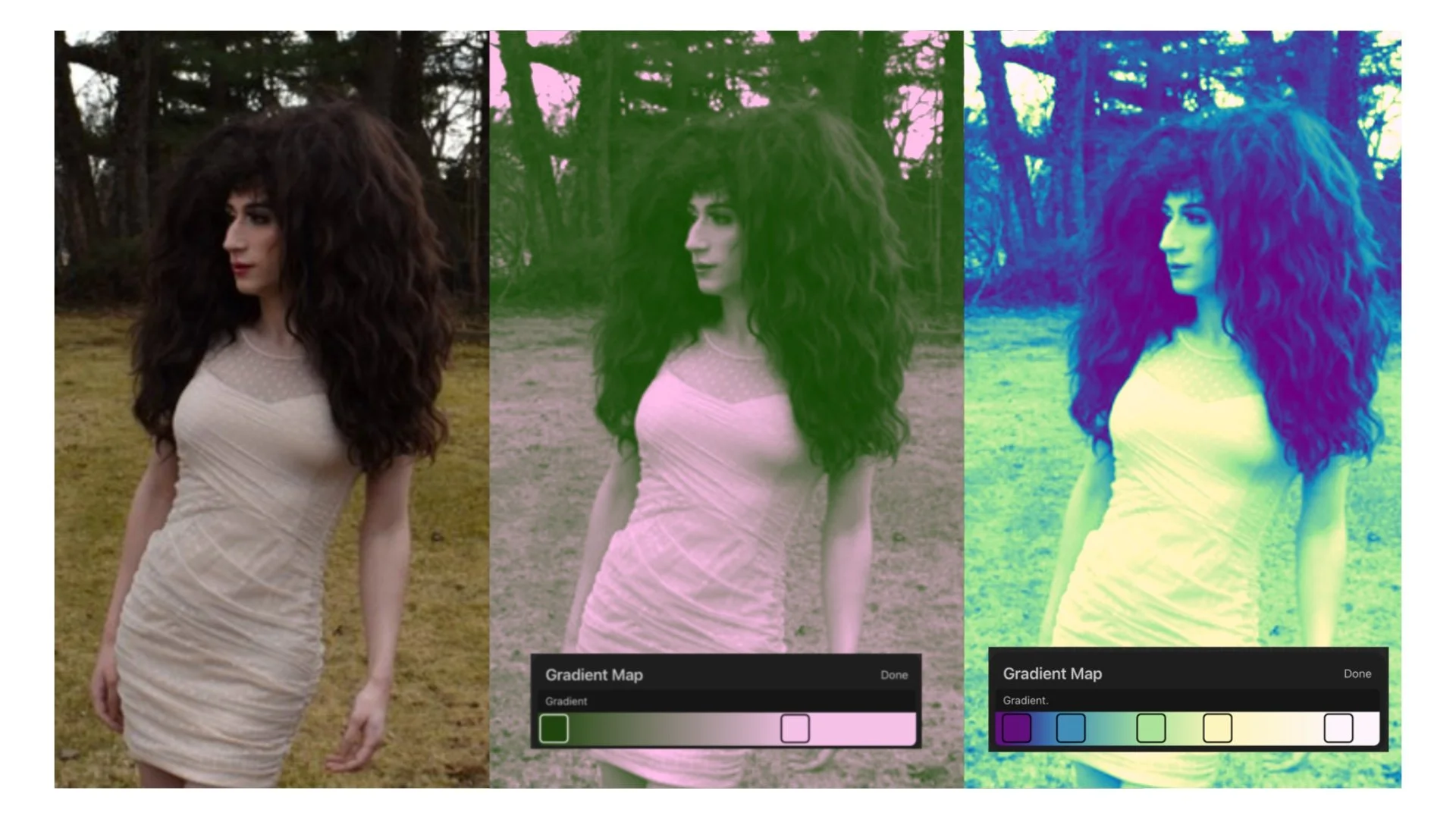
In the first example it takes the darkest parts of the picture and turns them green, and the lightest parts become pink. Then in the next one it goes from purple, to blue, to green, to yellow, and then white. I used a low-resolution thumbnail from my site for this because I was too lazy to find the picture in my drive wanted to show how lower quality images are still usable with the right editing.
I used Procreate for this, but most image editing software has some version of this. It’s a fast and simple way to make high impact changes to a photo. I’ve used it on most of my FAGIOLINA covers.

The most practical application for drag is for posters with group casts. It’s not realistic to do dedicated photoshoots with an entire cast together ahead of every show, so usually performers send in preexisting photos. These are taken under different lighting conditions in outfits that were not coordinated to go together. Gradient mapping can be a quick way to make a cast look more cohesive.
I designed this mock playbill for a Wicked themed show using a gradient map to make the whole cast pink and green. Both to make them all fit together better, and to fit the theme (I haven’t seen Wicked, but I know that much about it).
Colors that are opposite on the color wheel like pink and green, blue and orange, or purple and yellow are complimentary. They’ll usually stand out more next to each other. This same idea translates to fashion, makeup, and all other forms of art. Once you become aware of it, you’ll start seeing it implemented everywhere.
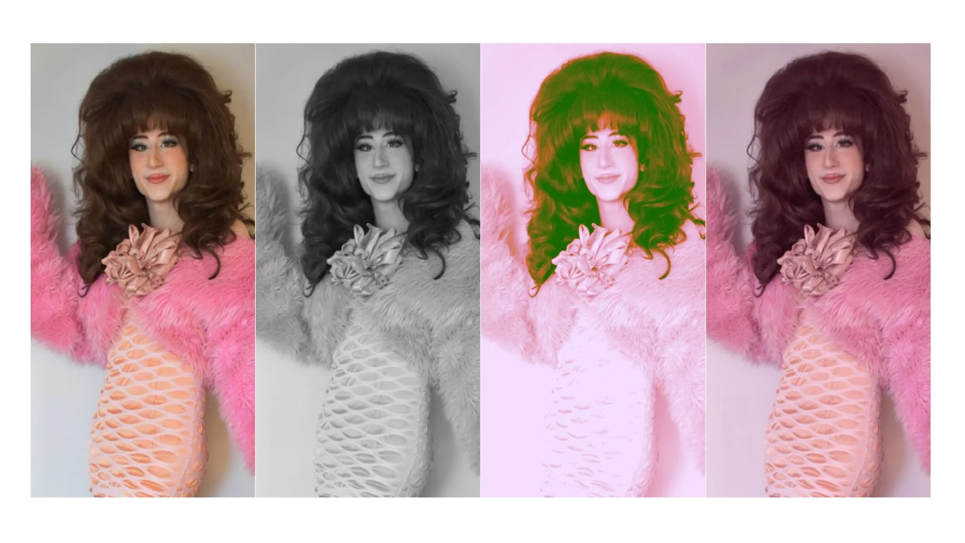
If a gradient map is too intense of an effect, a subtler option is to make a low opacity layer, set it to color mode, and fill it with a solid color. This unifies all the colors in the picture. Here’s a photo with no edits, in black and white, with a gradient map, and with a pink overlay. You can see just how much tone can be conveyed in edits alone.
Hope this helps! There are so many ways to approach any design. Understanding principles and techniques will hopefully allow you to work more intentionally. Have fun and stay creative (. ❛ ᴗ ❛.)
See more from this month in MAY 2025 FAGIOLINA